What if there was a spa for your brain?
Type: Interaction Design
Role: UX design, Brand Design, research
Platform: iOS
Design Tools: Figma
The problem
Traumatic brain injury treatment is often inaccessible to those living outside of cities.
The Hypothesis
An online platform that acts as a hub for brain injury recovery will improve a rural-dwelling patients recovery experience.
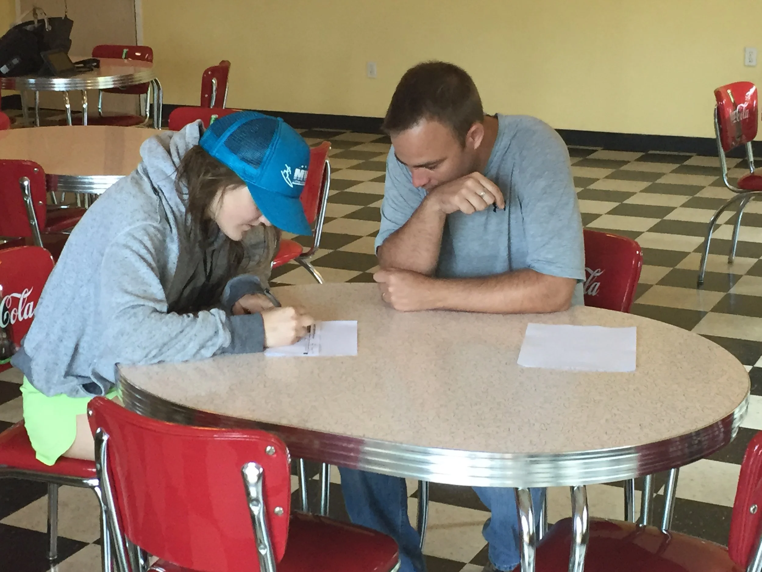
When I was 17, I was run over by a stoned driver while on a bike ride.
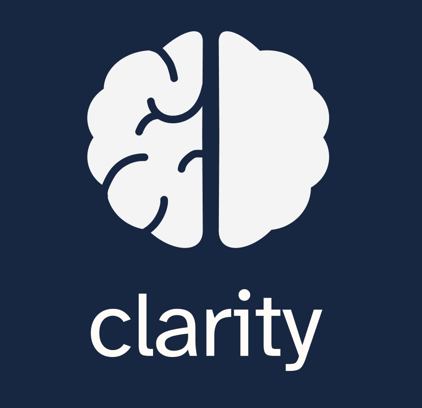
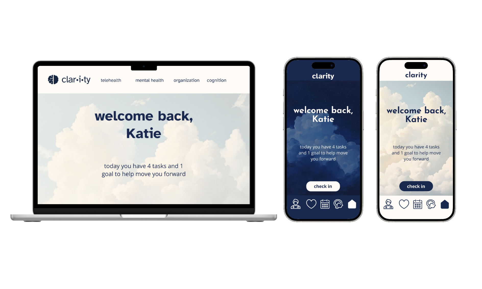
Heal your brain from the comfort of your own home
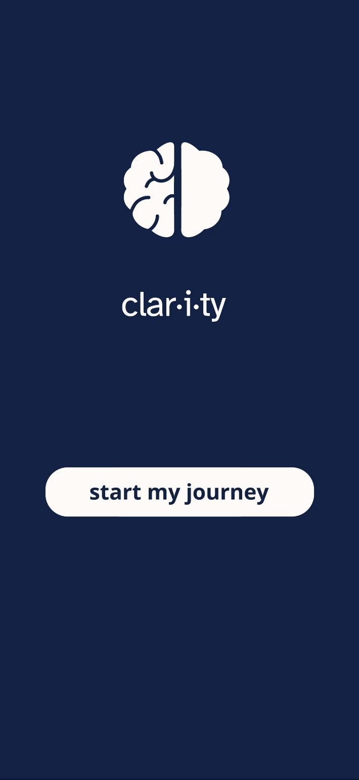
Meet Clarity
Clarity is a mobile app and web platform in the making that helps TBI patients return to their normal lives through telehealth access to neurologists, psychologists, occupational therapists, and more. It provides a place for healthcare providers to upload cognition and mental health tasks for patients to complete, giving the patients space to focus on their mental and physical wellbeing.
What are the barriers keeping people from receiving the treatment they need?
Geography, awareness, and disconnect between care providers
What is KEY to recovery?
Doctors appointments, mental health support, and cognitive training.
With so many areas involved in TBI recovery—physical, cognitive, emotional, and psychological—my first step was deciding what belonged in the platform. After the first round of feedback, I narrowed it down to telehealth, cognition, and mental health.
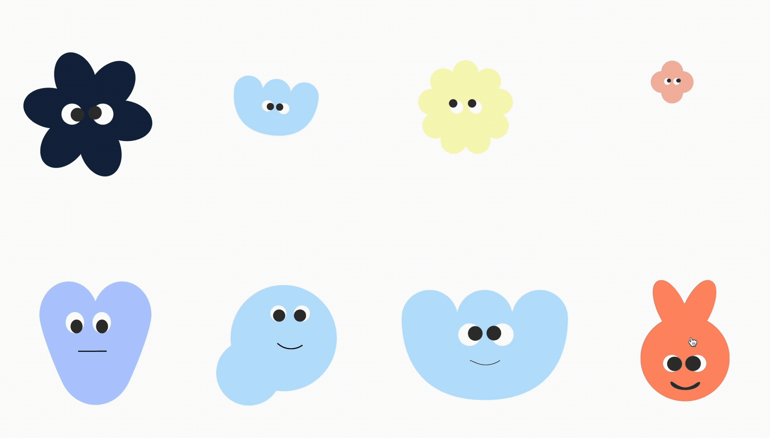
By including fun, colourful claracters to take the user through their recovery journey.
If someone suffered from a TBI in a more rural area, the chances of there being a specialty clinic nearby are scarce, meaning they either have to day trip for appointments or stay at the facilities' long-term care (which can be financially impossible and often times a bit depressing).
My goal with this platform is to provide users with a similar experience as if they were at a brain injury clinic, without the high financial, emotional, and time costs.

How might we provide patients with a more positive brain injury recovery experience?
Prioritizing Digital Accessibility
Allows for greater usage amongst more people
Designing for TBI patients meant accessibility wasn’t optional—it was integral. Many users may have compromised vision, cognitive fatigue, or sensory sensitivities. I consulted WCAG guidelines to define appropriate colour contrasts, font sizes, button spacing, and interaction patterns.
My biggest challenge was including the accessibility requirements while balancing the credibility of the platform without it feeling like another health app. These constraints were challenging, but with the goal of a better recovery experience for ALL, they were necessary.
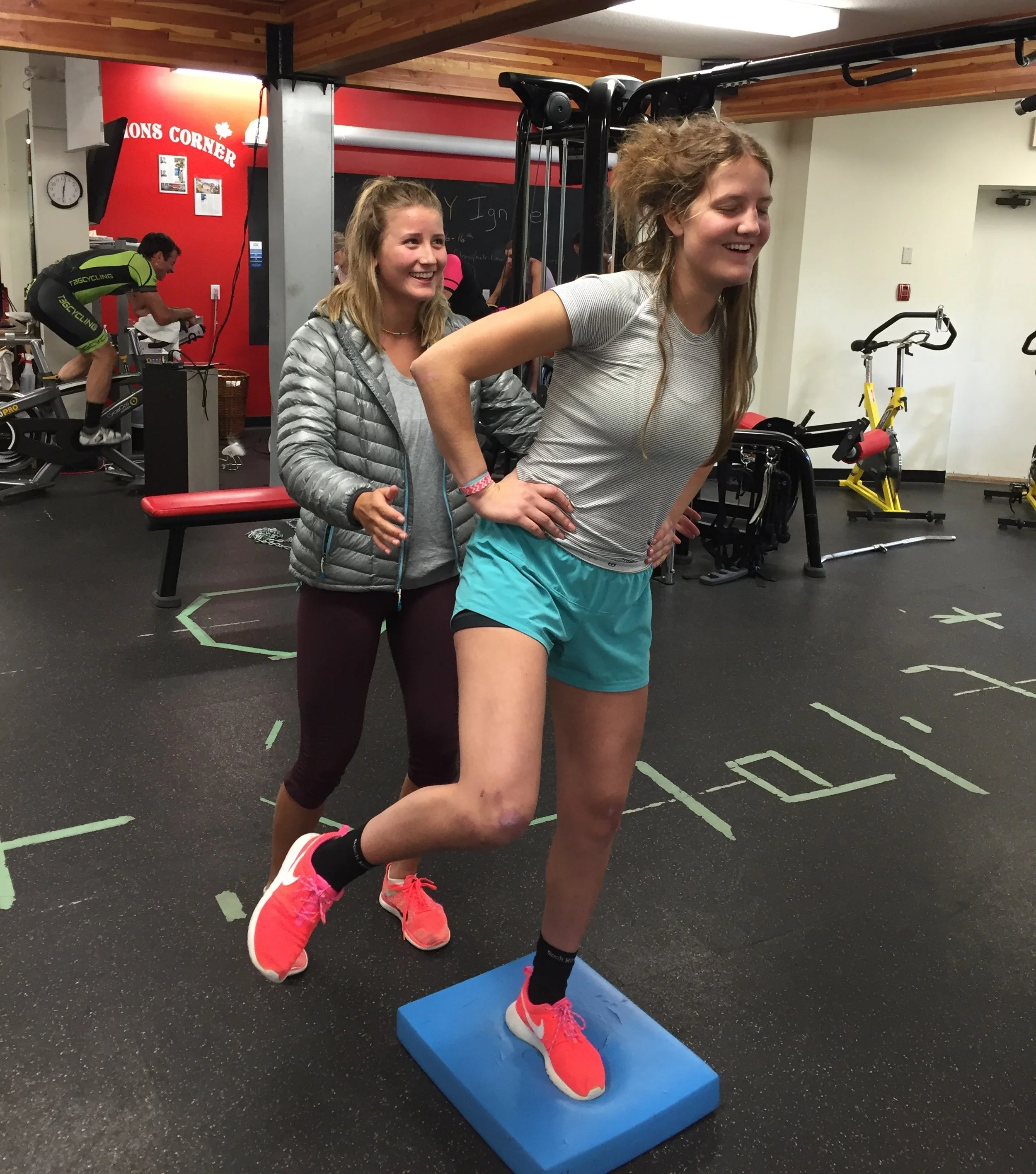
After returning home from spending 10 days in the ICU, I spent the next year commuting 8 hours per week, or 36 hours per month, to and from my Traumatic Brain Injury (TBI) rehabilitation appointments. As a teenager who had already missed out on months of teenager time, these appointments (and, more importantly, the drives to the appointments) became a burden instead of a road to recovery. I still went, determined to return to my normal, athletic life, but I wish that there was some way to minimize the travel time so that I was still able to get the treatment I needed, while freeing up all those hours to start getting my life back.
Many people living in rural mountain towns face a similar problem as I did: not having the resources or support to get the treatment they need, leading to unresolved problems or brains that simply cannot heal themselves.

Clarity was giving a more sterile doctor's office than the positive recovery massage I had envisioned, and after receiving a third round of feedback, I was determined to try adding something new. Meet Fred, Izzy, Jax, Frank, Remi, Sal, Dom, and Pia, my solution to blending purpose with personality. Through the inclusion of some key characters, I was able to bring my lighthearted brand tone to life, while giving enough seriousness to maintain credibility.

Scope and structure
I wanted to include light and dark modes on both desktop and mobile platforms, but as I began designing components and animations for everything, it became clear that something had to go. I shifted my focus to the dark mobile app wireframes so I could have a cohesive template to scale up from. I envisioned Clarity as the platform I wish I had during my own recovery. Many medical apps feel sterile or overly clinical, reinforcing the sense of being broken. I wanted to design Clarity with a sense of hope and lightness, like the light at the end of the tunnel.
Because everyone deserves a happy, healthy brain.
While the prototype may still continue to grow and adapt to feedback, Clarity has blossomed into the TBI safe space hub that I wish I had during my own recovery, letting users get their lives back. I hope that platforms like Clarity become more popular in hopes of improving the lives of people navigating their own TBI journey.
So what did I do?
As the creator, researcher, and brand designer, I led this project from initial research to final UI and prototyping. My responsibilities included brand development, UX/UI design, accessibility implementation, creating tokenized design systems and running JSON files.