
Improving the scalability of an online platform from web-based to iOS friendly
Type: Client based
Role: UX design, UI design, research
Platform: iOS
Design Tools: Figma
The Problem
An underdeveloped iOS app lacking usability and the brand’s personality.
The Hypothesis
A tab on the iOS app including new features will improve connection and increase branding.

How does one make new friends in the outdoors these days?
Founded in 2022, ILLA is an outdoor connection platform designed for women, by women. Think of a dating app, but just for meeting other females in your area who are interested in similar outdoor activities, at similar times, with similar abilities. As the web app continues to develop and gain popularity, scalability toward the IOS app store is crucial for continued growth and usability.
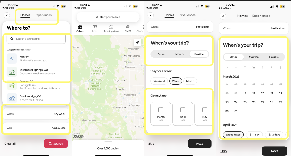
What is the current user flow?
Limited, to say the least…

When Tana, founder of ILLA, asked for assistance in scaling her website into a stronger app, we decided to tackle the “Explore All” page. The existing user flow was straightforward and easy to use, but missed opportunities to elevate the user’s experience, such as having calendar and map views, showing the ILLA-specific events in the same place as other users, as well as a filter function for specific activities.
Finding inspiration
Inspiration comes from many places, and in design, it can be useful to understand brands that your client likes or is inspired by. In the case of ILLA, Tana stated in the brief that one of her favourite websites is Airbnb. While designing our first pitch deck, we ran a low-fidelity case study of the website finding areas that improved usability while maintaining a clean aesthetic.
Narrowing the scope…
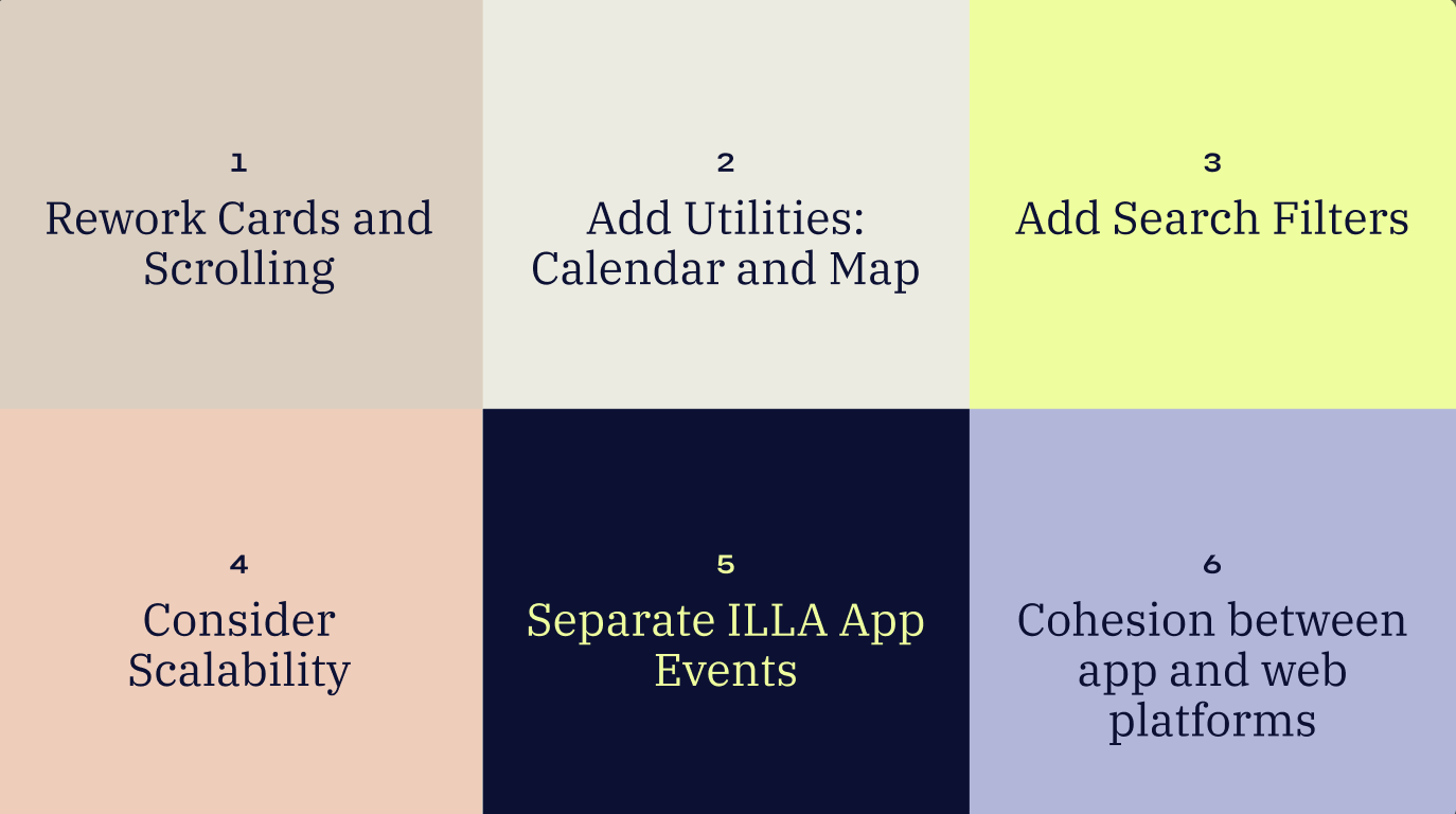
It was through the Airbnb case study that we found six possible ways to improve the scalability and UX of the app, which led us to the final three: add utilities, add search filters, rework cards and scaling. These three improvements will allow for easier scalability, make differentiating ILLA app events and user profiles easier, and allow for more cohesion between the web and app platforms.
First iterations
With the new features in mind, we combined new and existing ILLA features to sketch up the first round of low-fidelity wireframes. These wireframes aimed to show the essence of the new calendar, filter, and card features without including too much colour or detail.
What does the target audience even want?
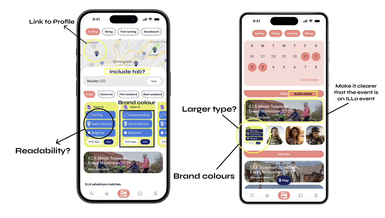
After presenting my higher fidelity wireframe prototypes to six outdoor-focused females, I gathered useful information regarding usability and readability, and learned what our target demographic wanted to get out of a female-focused outdoor app like ILLA.
Wireframes brought to life
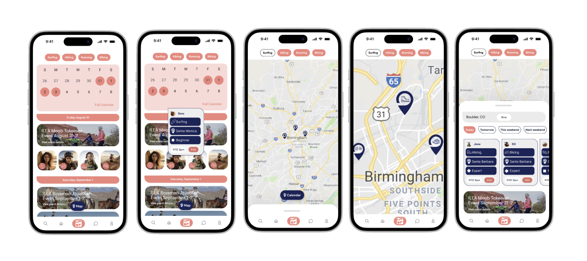
With the feedback in mind, I incorporated more of the brands colours, improved readability, included a map feature to go with the calendar feature, and improved the user cards and differentiated them from the ILLA events. The new Explore All page allows users to filter the sport they wish to do, select for specific dates or locations, and see what may be going on around them.
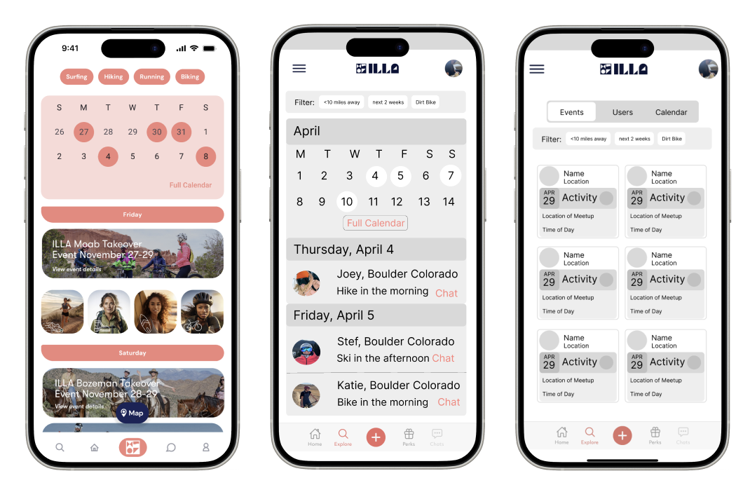
What does it look like in the app store?
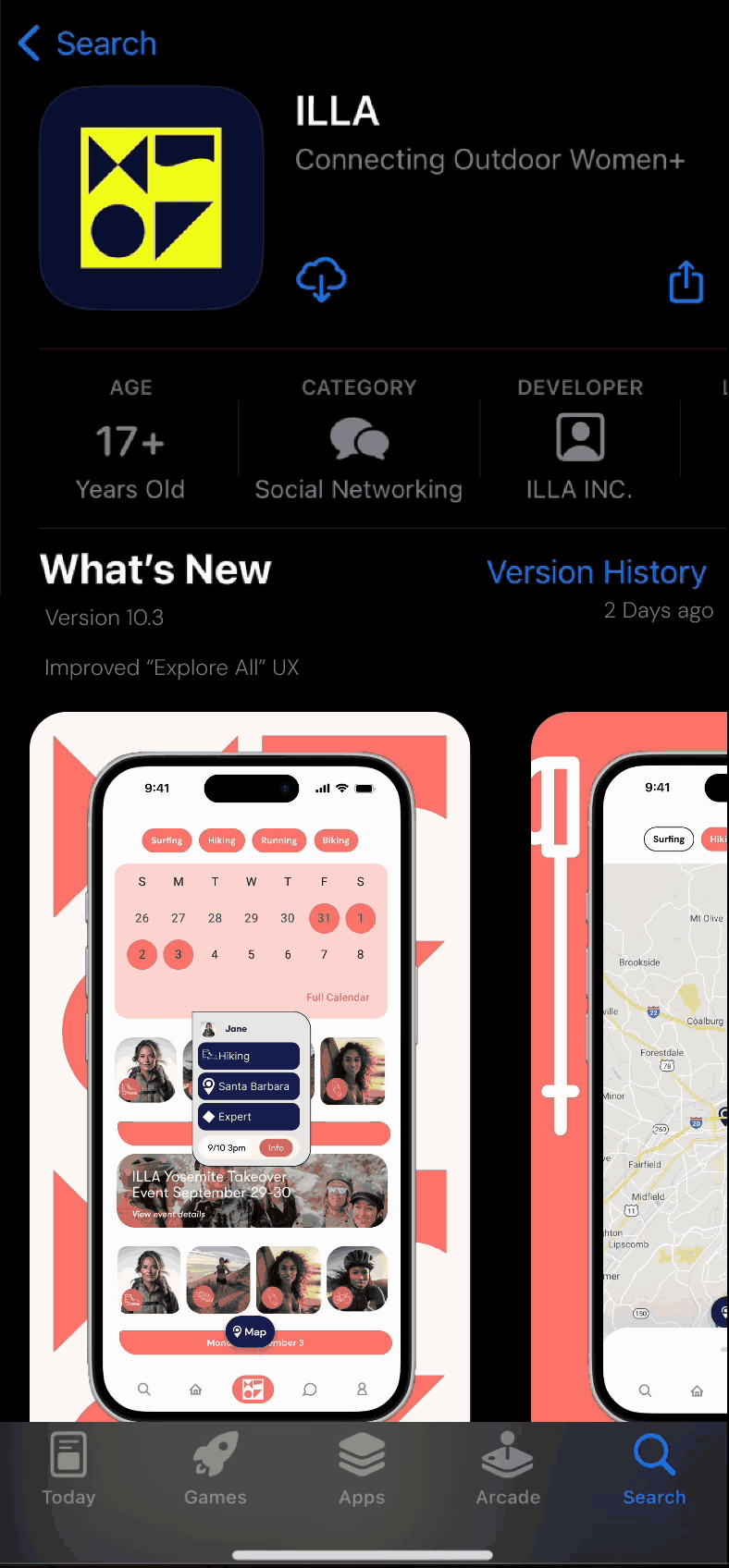
My final step was showing Tana what the updated “Explore All” page could look like in the app store. The updated colours, increased fidelity, and new screens are featured to increase excitement and potential surrounding the app.
The whole process from start to finish was cohesive and aimed towards growth. We wanted the updated ILLA Explore All tab to increase community, which was made possible through the inclusion of calendar and map views, as well as the improvement of user cards. Success can be measured by an increase in ILLA event attendance and user connection.
More Work
Cassiopeia
CLIF

Clarity mobile app